Module # 10 Time Series and Visualization
In this Module, we are taught about time series, time series models can be used to visualize past and predict future events. When creating a time series model you are looking for any outstanding changes or outliers in the visualization. Yau points out the issue with using discrete points on visualization as it can be difficult to read when there are multiple points. Each type of visualization has its own issues, so when choosing which to use it is situational for the type of data being used.
For my graphs, I used the given hotdogs dataset.

Using the barplot function does create a good visualization, but there are some issues, for one, there is no key with the code given so the reader will have to understand the code to get the meaning of the colors. In addition, more lines of code are required as we had to define what the colors meant in another line of code.

Creating a similar chart using ggplot2 provides much better results, with one line of code we can create an even better chart that includes a key, and defines the colors.

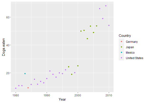
In an alternative version of the scatter plot, I decided to have each dot be color coded to the country. With this we can see that the United States have won the most, with Japan falling second.
Overall, with these visualizations, we are able to see how the winners of the hot dog-eating contest have changed over the years. Personally, I like the last graph the most because of the ability to see the countries that have won the most.


Comments
Post a Comment